ShopDreamUp AI ArtDreamUp

Deviation Actions


Description
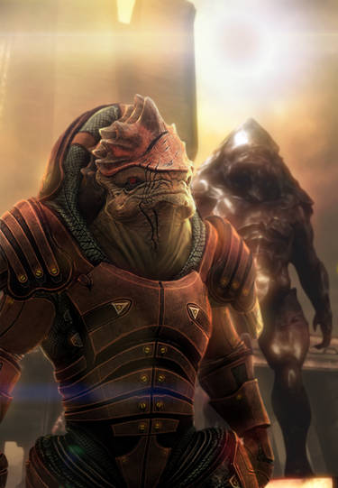
Farscape - Scorpius
Fan art (Smile)")
mr Harvey")
Farscape - one of the greatest TV series
wallpaper:
this work is dedicated to my friends
Ivan Doichinov and Ruslan Rusev
Photoshop;wacom 2-3hours
progress soon.
(c)Inca - Alexander Nanitchkov
Fan art
mr Harvey
Farscape - one of the greatest TV series
wallpaper:
this work is dedicated to my friends
Ivan Doichinov and Ruslan Rusev
Photoshop;wacom 2-3hours
progress soon.
(c)Inca - Alexander Nanitchkov
Image size
1200x1697px 235.44 KB
© 2009 - 2024 Tsabo6
Comments61
Join the community to add your comment. Already a deviant? Log In
I can't believe Scorpius - one of the coolest villains of sci-fi ever - to be the motif of my first critique! So I'll try my very best (and at least I'm a Farscape expert)! <img src="e.deviantart.net/emoticons/w/w…" width="15" height="15" alt="
The background looks a bit hasty, but the colours are well chosen - giving a well suiting impression of heat, considering he is a half-scaran. If the intention was a Peacekeeper environment, it should be more clear. Anyway, the red is a bit too bright and saturated, taking too much attention away from Scorpius' headgear.
The eye portion is excellent, and carries this typical Scorpius expression. Still, I think the shadows in his face are overall too dark, and his mouth looks too soft - the lower lip is too pouty (reminds of Crichton-Scorpy <img src="e.deviantart.net/emoticons/w/w…" width="15" height="15" alt="
The chest area lacks detail, you might want to go further into this. Scorpius' highly detailed armour should get more attention in a work over - despite it being quite cool already, especially the textures on the headgear, which are great! Whatever brushes were used, they were the correct ones.
I do think several light sources are a good thing, and it is widely executed very well, but I'm having trouble making out the exact direction the light(s) come from. His headgear has strong highlights on the side turned to the viewer, yet his cheekbone is casting a pitch black shadow. On the other hand, the orange light on his stomach reflects well from his shoulder plating.
The overall, slightly off-center composition is fine, and the frame was a nice idea. However, I think a fan-art piece could do with a bigger and more elaborate lettering, possibly a mockup of the Farscape font. The brushstrokes are very nice and lively, giving of the suitable sense of movement expected in a Farscape piece.
Well done! <img src="e.deviantart.net/emoticons/c/c…" width="20" height="20" alt="