ShopDreamUp AI ArtDreamUp


Suggested Deviants


Suggested Collections


You Might Like…


Featured in Groups


Description
Updated - reduced the light on her leg
I guess it is ready.
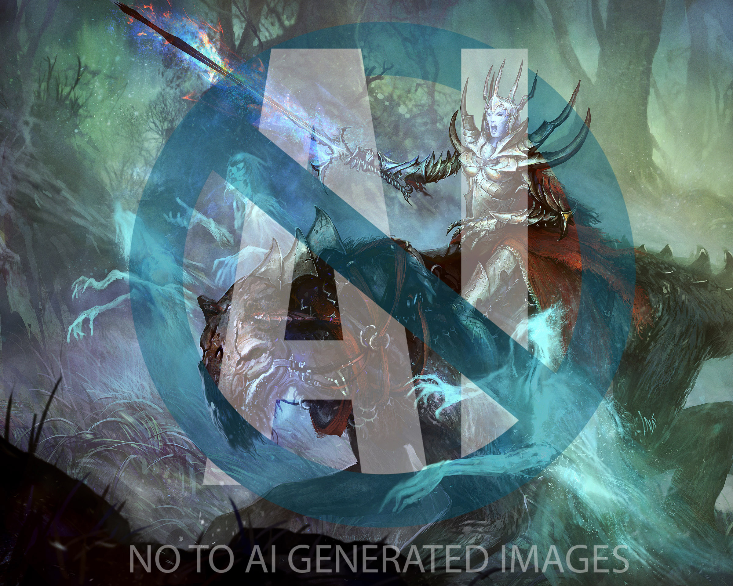
Xiara, sovereign of souls
death-bringer-something card for tcg Spellweaver www.spellweaver-tcg.com/
 ©Dream Reactor
progress on wipnation: www.wipnation.com/posts?PostKe…
hope you like it (Smile)")
Alexander Nanitchkov - www.artofinca.com artofinca.com/
add me @ DeviantArt tsabo6.deviantart.com/
add me @ CGhub artofinca.cghub.com/
add me @ WiPnation www.wipnation.com/citizen/arto…
add me @ ItsArtMag artofinca.itsartmag.com/
add me @ Shadowness shadowness.com/Artofinca
I guess it is ready.
Xiara, sovereign of souls
death-bringer-something card for tcg Spellweaver www.spellweaver-tcg.com/
progress on wipnation:
hope you like it
Alexander Nanitchkov - www.artofinca.com artofinca.com/
add me @ DeviantArt tsabo6.deviantart.com/
add me @ CGhub artofinca.cghub.com/
add me @ WiPnation www.wipnation.com/citizen/arto…
add me @ ItsArtMag artofinca.itsartmag.com/
add me @ Shadowness shadowness.com/Artofinca
Image size
2400x1920px 1.2 MB
© 2013 - 2024 Tsabo6
Comments60
Join the community to add your comment. Already a deviant? Log In
hey Alex,
beforehand:
link to the OP: sta.sh/0bcq4v1lfe5
(*1: I've cropped the piece so one can view the whole comparison file on the screen
*2: Please be aware that I did this overpaint rather fast)
-
The shape of the rider is good but the thorns are swamping into the background in the thumbnail. you don't have to overdo the shading in cases like that I'd say.
be free there and let them be darker than it would be in reality (:
I also made them thicker so they pop out more (the warcraft effect lol).
I like scenes like that with the ghost light and the foggy forest surrounding a lot (the bg is rather graphical but I love this kind of stuff), but as you can see in my overpainting, you could have pushed that foggy feeling further without even swamping the most important and for the illustration vital parts (the head of the beast and her).
So I think controlling the value contrasts more is important too. Less black is more black often.
Also in terms of pushing the "haunting" feeling and the secondary lightsources (ghosts). If you light her too strong with the primary the secondary won't do much effect anymore. Besides that some areas are unaffected of the ghost light, which I've add in the overpainting.
Another thing that jumped right to my attention is the saturation of the red. I really think it must be less saturated in a light like that (see overpainting)
everyone loves pointy armor parts on beasts. <img src="e.deviantart.net/emoticons/s/s…" width="15" height="15" alt="
Great shapes. those just don't seem to follow the body shape 100%, I've quickly morphed them a bit so you see what I mean.
As Kainan pointed out, the one arm looks little bit off (the other one is a little thin too, if you consider she wears some kind of cloth beneath the armor and the armor itself got some volume too).
What I like especially about the work is the head of the beast, the background and the vision here. It's classy. The approach on her upper body armor with the overlapping pieces has some good potential too.
Well well, illustrations are full of endless possibilities!
-
Phew .. so yeah, quite some time spent. I hope this is helpful to anyone reading and adds to understanding (:
All the best,
Aerozopher